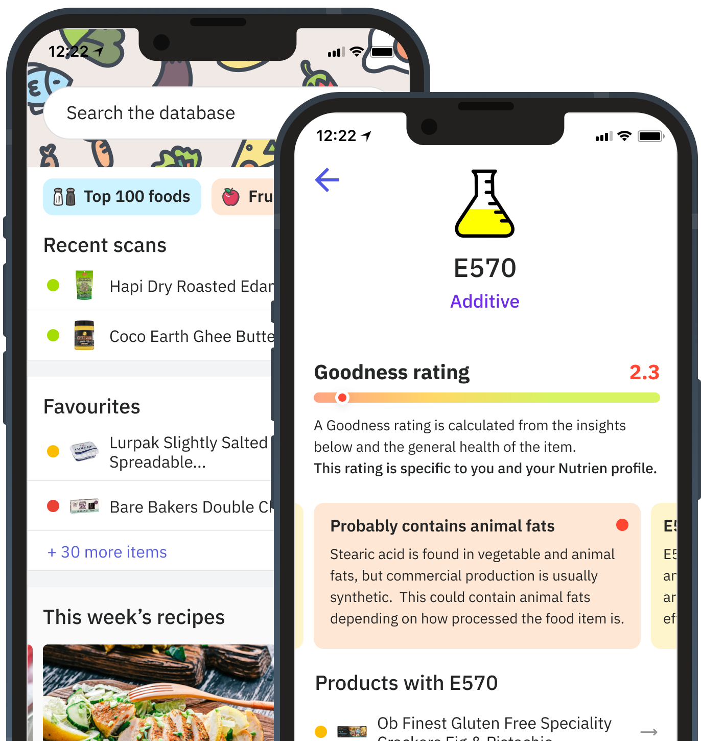
Nutrition App Concept
Hackathon turned into a real product, I designed an app that simplifies nutrition for anyone with dietary needs.

The current system (a way to record the sale & transfer of livestock in Australia) was complex and frustrating for its users. The company responsible for the system wanted to concept an entirely new vision without taking time from their developer's business-as-usual activities.
I worked as a designer and developer for this project. I created the design system components and designed the future concept with the client. I also worked with another developer to build the design system using React, Typescript & TailwindCSS.
Another team conducted the research, and the flow and features was a collaborative effort between the client, myself and the user research team.
The design system has four levels: foundations, components & patterns. Foundations are elements that make up the entire experience, like text, colour, space & icons. Components then are made up of foundational and other components. Patterns represent communication between components like a Modal or Tooltip. Layouts are assemblies of components like a page. Figma's auto-layout & variants feature enables components to be close to how someone would code them.
Previous research showed that users of the system are not very computer literate - so the fundamental principles for design were accessibility & usability. All elements adhered to WCAG 2.1 guidelines to ensure that components were easy to click and see.
TailwindCSS was the best choice for our component styling due to the ease of use and maintenance. TailwindCSS's purging feature made it easy to compile CSS files to only use the classes defined in the code - avoiding any bloat.
Since the design system supports multiple brands using React context → provider methods, we created a utility in Storybook's home screen to switch to any chosen brand.
Due to the complexity of the livestock system and its flows, previous user testing with just static designs hadn't yielded quality results. This time, I produced the prototype in a front-end only environment using the ReactJS design system. Prototyping in this way meant you could take the user through flows, and it would feel close to the real thing.
Some business API's we're connected to add to the realism of the experience. One API allowed participants to select their from and locations using a unique address lookup (a PIC register).
This approach in usability testing provided precise and detailed feedback, which fed into a few iterations and rounds of testing.
As the logic and flows had been thoroughly tested out in the prototype, working with the product owner and writing all JIRA stories was straightforward. By having the discovery stage of the project during prototyping, confidence was high that what is in production is correct for the user. JIRA also became more of a task list rather than a bunch of spikes and stories as developers and business analysts had the prototype as a strong reference point.
Hackathon turned into a real product, I designed an app that simplifies nutrition for anyone with dietary needs.

